
A frameless little widget that floats on your desktop and shows what your machine is actually doing. Colourful, translucent graphs for the processor and its cores, memory, disks, the network, and the GPU, all scrolling smoothly in real time. It sits in the corner, stays out of the way, and turns the usual wall of numbers into something you can read at a glance.
Why I Built This
I like knowing what my computer is up to. Not in a Task-Manager, open-a-window-and-squint way, but at a glance — a quick look to the corner of the screen to see whether the CPU is pinned, whether memory is running tight, whether the disk is thrashing or the network is busy. The Task Manager is a fine tool, but it is a window you open when something is already wrong. I wanted the opposite: a quiet gauge that is simply always there.
There is a whole genre of gadget-style monitors, and I have used several over the years. They tend to be either heavy and skinnable to the point of fiddliness, or so minimal that they only show one number. I wanted something in between: attractive, transparent, and information-dense, but self-contained and fully under my control — no installer, no runtime to chase down, no account. Just an app I can drop on the desktop that reads the values Windows already exposes and draws them nicely.
So I built HWSysMon — a transparent, frameless desktop widget that samples the system’s performance counters and paints them as smooth, colourful graphs, with a tray icon and a right-click menu for the few things you occasionally need.
With the help of Vibe Coding, HWSysMon grew from “draw a CPU line” into a proper little monitor: composite cards that pack several metrics into one, buttery-smooth scrolling that stays fluid even on a sixteen-core machine, a tabbed options dialog, per-graph colour editing, and a GPU graph that only appears when the hardware can actually report it. Most of it was a conversation — I described what bugged me, tested it live on real hardware, and the tool sharpened itself one small step at a time.
What Is HWSysMon?
HWSysMon is a lightweight Windows desktop widget. It is a transparent, borderless window with no title bar that you drag wherever you like — by default it parks itself in the top-right corner, gadget style. Inside it stacks a set of cards, each drawing one or more translucent, coloured graphs that scroll continuously from right to left as new samples arrive. It is a single self-contained app: no installer, no runtime to hunt down, nothing to configure before it starts telling you something useful.
Everything it shows comes from the values Windows already keeps — the performance counters for the processor, memory, physical disks and network adapters, plus the Win32 memory and GPU figures. HWSysMon samples them on a background thread once per interval, keeps a rolling history, and repaints the graphs every frame so the lines glide rather than jump. There is a system-tray icon, and a right-click menu — identical whether you right-click the widget or the tray icon — offering Options, About, and Exit.
Colourful, Translucent Graphs
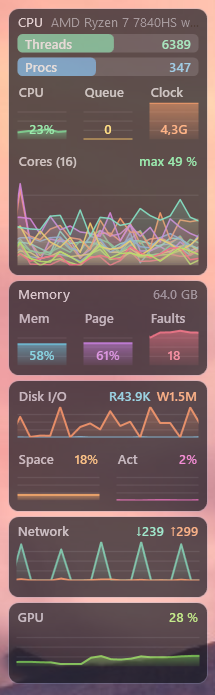
The look was the whole point. Each graph is a translucent coloured area with a brighter line on top, drawn over a dark, semi-opaque card so it reads clearly against any wallpaper. Every card has a small heading and its current value, and the colours are chosen to be distinct — so a glance is enough to tell the download line from the upload line, or the disk read from the write.
The graphs update the way the eye likes: smoothly. Rather than stepping forward once per sample, the whole line slides continuously between samples, so it flows past like a heart-rate monitor instead of ticking like a clock. The scroll speed is defined in pixels per second, independent of how often the values are refreshed, so a slower refresh simply spreads the points further apart without changing the feel.
Composite Cards That Pack More In
A monitor is only useful if it shows enough without becoming a skyscraper of tiny boxes. So the main cards each combine several related metrics. The CPU card carries a headline with the processor’s name, two little bars for the live thread and process counts, a row of three graphs — overall load, the scheduler queue, and the current clock speed — and then the individual cores, either overlaid in one multi-colour graph or laid out two per row.
The Memory card shows a headline with the installed RAM size and a row of three: usage, the page/commit level, and hard page faults. The Disk card puts read/write throughput across the full width, with drive space and disk activity as a pair beneath it. Network splits download and upload into two coloured lines, and GPU shows overall utilisation. When three graphs share a row, the percentage is drawn inside the graph just above its baseline, so the heading keeps the full width and nothing overlaps.
Choose Your Graphs, Arrange Them Your Way
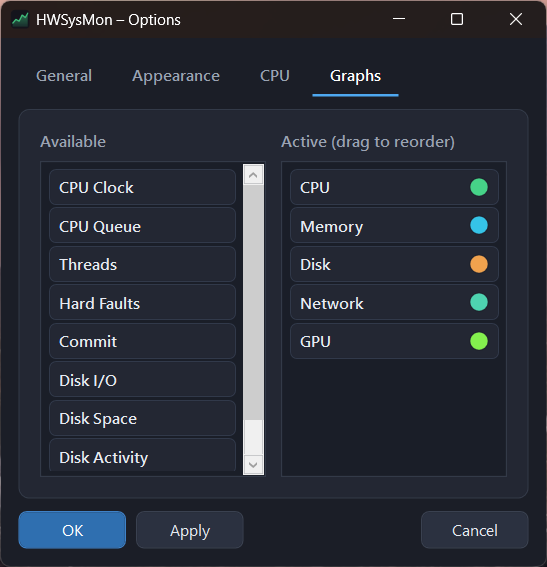
Not everyone cares about the same things, so the set of cards is entirely yours to choose. In the options there are two lists — Available and Active — and you drag graphs between them and reorder the active list by hand. Alongside the composite cards, every individual metric is also available on its own: a standalone CPU-clock graph, a threads graph, hard faults, commit, disk I/O, disk space, disk activity, and more.
- Drag to activate — move a graph from Available to Active to show it.
- Drag to reorder — arrange the active cards top to bottom however you like.
- Composite or individual — use the packed cards, or pick out single metrics.
Every Colour Is Yours
Each active graph carries a little colour dot, and clicking it opens a colour editor made for that graph. A composite card exposes all of its parts — the CPU card, for instance, lets you set the colours for CPU, Queue, Clock, Threads, Processes, and one entry per core, generated to match however many cores your machine has. Pick a colour and the matching line, fill, and value text all change together. Your choices are saved, and a Reset button puts any graph back to its defaults.
Transparent, On Top, Right Where You Left It
The widget is built to live on the desktop without getting in the way. A transparency slider runs from fully opaque to nearly see-through, so you can tune how much of the wallpaper shows behind it. Always on top keeps it above other windows, and can be switched off when you would rather it stayed behind them. You can set the width of the column and the spacing between cards, and choose how fast the graphs scroll.
It also remembers where you put it. Move it to a second monitor, close it there, and it comes back to the same spot on the same screen next time — and if that monitor is gone, it quietly falls back to a sensible corner instead of opening off-screen. On a fresh machine it simply starts in the top-right, ready to be dragged wherever suits you.
Smooth Even on a Big Machine
Here is a subtle one that took some detective work. On my main machine — sixteen cores and a real GPU — the graphs would hitch briefly at every refresh, while the same build ran perfectly smoothly in a virtual machine. The culprit was reading all those performance counters on the same thread that draws the screen: sixteen per-core counters plus dozens of GPU-engine instances add up to a few milliseconds of work, landing right in the middle of the animation.
The fix was to move the sampling onto a background thread and only hand the finished snapshot back to the UI to draw, and to rescan the ever-changing list of GPU engines only every couple of seconds rather than on every tick. The result is a monitor that stays fluid regardless of how much hardware it is watching — which is exactly what a thing you glance at all day should do.
The GPU Graph — When It Can Be Read
Modern Windows exposes GPU utilisation through its own performance counters, and HWSysMon reads them to show overall GPU load — summing the busy engines and taking the busiest type. But not every system can report this, so the GPU graph is conditional: if the counters are not available, it simply does not appear in the list of graphs at all, rather than sitting there showing a flat, meaningless zero. On the machines that can, it drops in automatically.
The Little Things That Make It Pleasant
A Dark, Modern Interface
The options and about dialogs wear the same dark theme as the widget, right down to a dark title bar, custom checkboxes, sliders, and flat, rounded buttons. The right-click menu is a clean dark strip with a soft rounded highlight. Small touches — the value tucked neatly above a graph’s baseline, a heading trimmed with an ellipsis when a card is narrow so the number always wins — are the kind of thing you never notice when they are right.
Sensible Numbers for the Bars
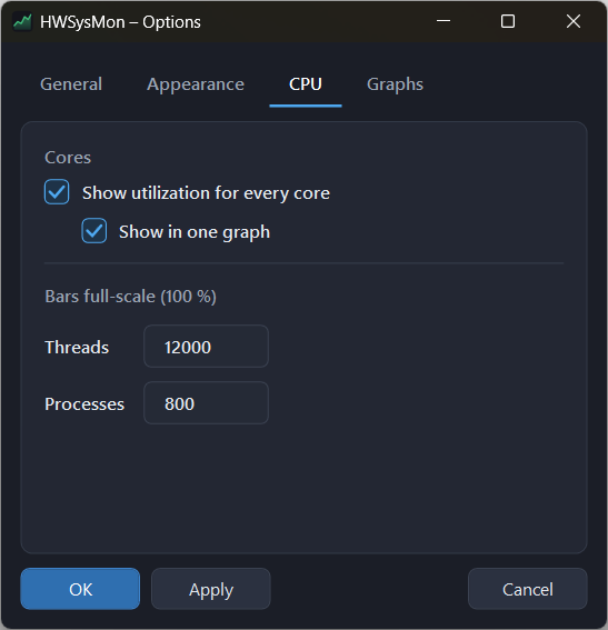
The thread and process bars need a full-scale value to fill against, and the right number depends on how you use your machine. So those maxima are configurable — plain number fields in the options, defaulting to twelve thousand threads and eight hundred processes — and the bars fill proportionally against whatever you set.
Portable Settings
All your choices — which graphs, in which order, their colours, the sizes, the behaviour — live in a single HWSysMon.json next to the executable, so the app is genuinely portable. If it is installed somewhere read-only, it quietly falls back to your per-user app-data folder instead, so saving never fails.
Tip: Right-click the widget for Options, and start on the Graphs tab — drag in exactly the cards you care about, then click a colour dot to make each one your own.
Portable by Design
HWSysMon is a self-contained Windows app with no external dependencies. It reads only the metrics Windows already exposes, keeps its configuration in one JSON file, and shares its icon between the window and the tray. There is no registry sprawl and nothing hidden away, so you can drop it onto another machine and be watching your system in seconds.
Where It Stands Today
What started as a single scrolling CPU line has grown — with a lot of help from Claude Opus — into a monitor I keep in the corner of every screen: composite cards for CPU, memory, disk, network and GPU; individual graphs for anyone who wants them; smooth, refresh-independent scrolling that holds up on a sixteen-core box; a tabbed options dialog; per-graph colour editing down to each core; a conditional GPU graph; adjustable transparency, width and spacing; and a position it remembers across monitors and restarts.
It is still a small, focused tool by design, and that is the point. It does one everyday job well — showing what the machine is doing, clearly and beautifully — and then gets out of your way. Shaped one small conversation at a time, it is the desktop monitor that fits the way I like to work.
If you have ever wished you could just glance at the corner of the screen and know what your computer is doing — HWSysMon is my answer to that wish.